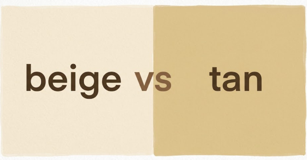
When it comes to neutral colors, the debate around beige vs tan comes up more often than you might think. At first glance, they look almost identical, and many people even use the terms interchangeably. But if you look closely, there are subtle differences in tone, warmth, and usage that set them apart.
In this guide, we’ll break down everything about tan vs beige color, where each is used, and whether they are actually the same or not.
Is Beige and Tan the Same Color?
Short answer: not exactly.
While beige and tan belong to the same neutral family, they are distinct shades. Both are created by mixing brown with white or gray, but the balance of tones is what makes them different.
- Beige → Lighter, softer, slightly creamy or grayish
- Tan → Darker, warmer, and more brown-based
So, when people ask “is beige and tan the same color?” the answer is no—but they are very close relatives in the color world.
Beige vs Tan: Side-by-Side Comparison
Here’s a simple breakdown to help you visually and practically understand the difference:
| Feature | Beige | Tan |
| Base Tone | Light brown + white/gray | Medium brown + yellow/orange |
| Brightness | Lighter | Slightly darker |
| Warmth | Cool-neutral | Warm-neutral |
| Common Use | Interiors, minimal design | Fashion, leather goods |
| Mood | Soft, calming, elegant | Earthy, cozy, natural |
This table makes it easier to understand tan vs beige color differences in real-life applications.
Beige: Meaning, Tone, and Usage
Beige is often described as a soft, understated neutral. It leans toward a pale sandy color with subtle gray or cream undertones.
Where Beige Is Commonly Used
Beige is popular in spaces where calmness and simplicity are desired:
- Interior walls and minimalist décor
- Office spaces for a clean look
- Fashion basics like coats and trousers
- Branding that wants a neutral, elegant feel
Because it is so light, beige works well as a background color without overwhelming other elements.
Tan: Meaning, Tone, and Usage
Tan is slightly deeper and warmer compared to beige. It resembles the color of natural leather or sun-kissed sand.
Where Tan Is Commonly Used
Tan is more noticeable and grounded in design:
- Leather shoes, belts, and bags
- Outdoor furniture and rustic interiors
- Autumn fashion collections
- Natural-themed branding
Its warmth makes it feel more earthy and organic compared to beige.
Beige vs Tan in Fashion and Design
When choosing between beige vs tan, context matters a lot.
Fashion Use
- Beige: Clean, minimal, soft luxury look
- Tan: Warm, vintage, rugged aesthetic
Interior Design Use
- Beige: Opens up space, feels airy
- Tan: Adds warmth and depth
Branding Use
- Beige: Calm, premium, modern identity
- Tan: Natural, grounded, earthy identity
Why People Confuse Beige and Tan
The confusion happens because:
- Both are neutral earth tones
- Lighting changes how they appear
- Digital screens distort color perception
- Different industries define them loosely
So yes, it’s very common to mix them up in everyday conversation.
Quick Tips to Tell Them Apart
If you’re unsure whether a color is beige or tan, here’s a simple trick:
- If it looks lighter and almost creamy → Beige
- If it looks warmer and closer to brown → Tan
This mental shortcut helps especially in design and shopping decisions.
FAQs About Beige vs Tan
1. Is beige and tan the same color?
No, beige is lighter and cooler, while tan is darker and warmer.
2. What is the main difference between tan and beige?
The main difference is tone—beige is pale and neutral, while tan has more brown warmth.
3. Which is lighter, beige or tan?
Beige is lighter than tan.
4. Can beige and tan be used together?
Yes, they often pair beautifully in fashion and interior design because they are complementary neutrals.
5. Why do people confuse beige and tan?
Because they sit very close on the color spectrum and vary slightly depending on lighting.
Conclusion
Understanding beige vs tan comes down to recognizing subtle differences in warmth, depth, and usage. Beige is softer, lighter, and more neutral, while tan is warmer, deeper, and more earthy.
Both colors are timeless and versatile, which is why they remain popular in fashion, design, and branding. Once you learn the difference, choosing between them becomes much easier—and often depends on the mood you want to create.
If you’re exploring neutral palettes, try experimenting with both shades together to see how beautifully they balance each other out.